Start a project

Web design UX & UI Development Optimisation

Made to turn heads. Built to move business.

We build distinctive websites and digital experiences where thoughtful design, smart technology and business strategy come together.

Who it's for

Designed for [ growing brands ready for their next move ]

Swipe or tap to change it

Pretty is a good start. Purpose is better. We start with your goals, your customers and the path between arriving and taking action.

Selected work

The work can speak. We'll explain the thinking.

Proposed redesign Staging preview, not yet live

ForestCow

Complete redesign Strategy · UX/UI · Visual design · Development · Forms

From a basic product-information site to a richer brand experience: clearer product education, recipe discovery, stockist navigation and a separate path for wholesale enquiries.
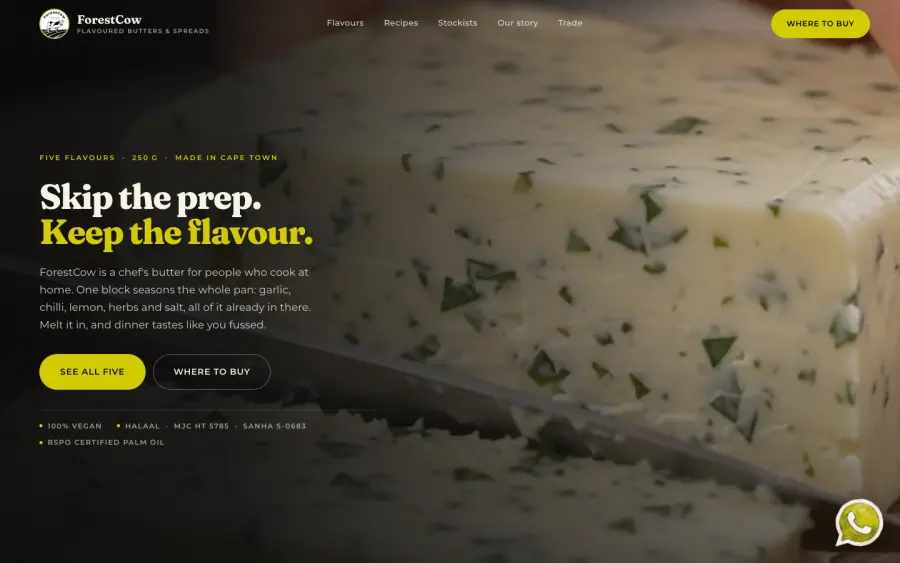
After, the proposed Websight redesign: first screen with the headline Skip the prep. Keep the flavour.
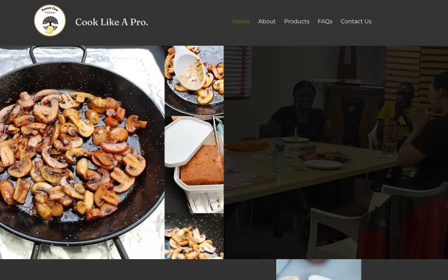
Before, the existing website: first screen with the logo, Cook Like A Pro and a photo collage.
Before Existing website After Proposed Websight redesign
Drag the line, or use the arrow keys

Screenshots of both websites, captured on 23 October 2026 at the same screen sizes. The redesign is a staging preview and isn't live on forestcow.co.za yet.

Brief

ForestCow blends vegan flavoured butters in Cape Town. The existing Wix site is one long page that leads with the company's story. Flavours, stockists and trade enquiries all end at the same phone number and email address.

Approach

Lead with what the product does for someone cooking tonight. Then give each audience its own path: shoppers to flavours, recipes and stockists; retailers and caterers to a dedicated trade section.

Decisions

What changed, and why
BeforeAfter
Promise“Cook Like A Pro” and general company copy“Skip the prep. Keep the flavour.” The product promise comes first
StructureOne long informational page with section navigationA content-rich scroll with clearer journeys
ProductsFive flavour descriptions and a catalogue downloadFive selectable flavours with uses, ingredients and nutrition
RecipesServing suggestions tucked into product copyA browsable recipe book with ten ideas, two per flavour
Where to buyContact or order by phone or emailCheckers and Food Lover's Market pathways, plus ordering direct
TradeA manufacturer and co-packer descriptionA dedicated trade offer with pack sizes and private label
Staying in touchA general contact form and FAQRecipe-card signup, customer reviews, fuller FAQs and contact options

The rebuild moves from explaining the company to helping shoppers understand the flavours, imagine a meal, find a stockist and get in touch. It also separates everyday shoppers from wholesale enquiries, so each gets a path that fits.

Results

Not measured yet. This is a design and scope transformation, and no traffic, enquiry or sales data has been collected, so we're not claiming any.
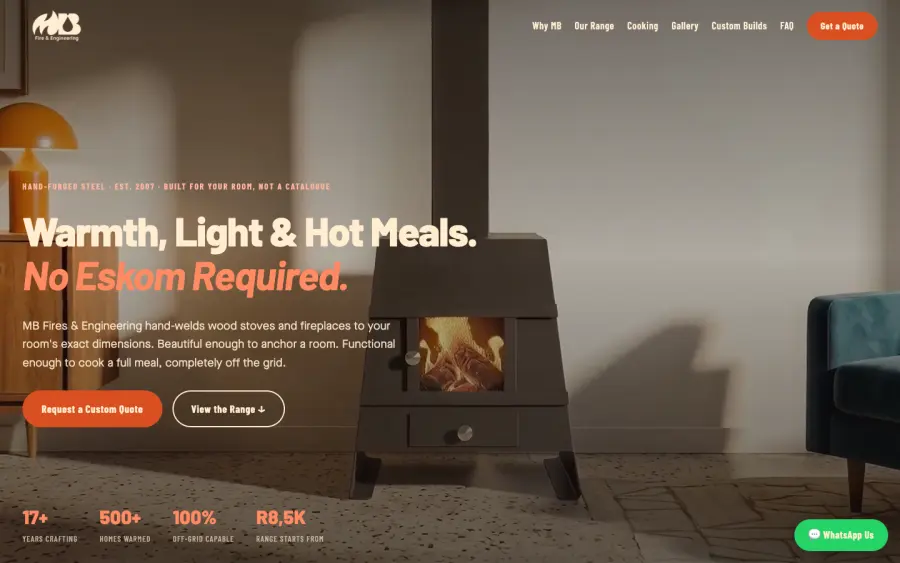
MB Fires and Engineering preview, desktop: headline Warmth, Light and Hot Meals. No Eskom Required, over a wood stove.
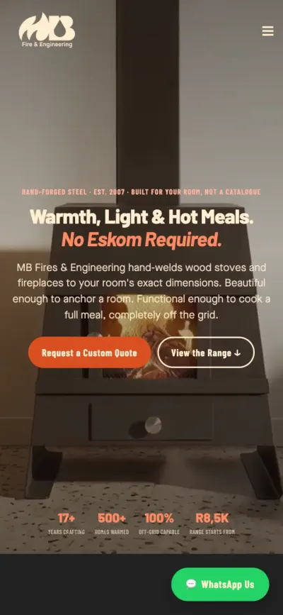
MB Fires and Engineering preview on a phone: the same headline with quote buttons.

Preview build

MB Fires & Engineering

Hand-built wood stoves and fireplaces

A quote-led site for a workshop that hand-welds stoves to fit each room. The job: make a made-to-order product feel easy to price and easy to ask about.

Decisions

  • A guided quote form (model, package, installation, placement) instead of a blank contact box.
  • A 3D gallery of real installs, not renders.
  • Hero video cut from about 9MB to about 720KB so the first screen loads quickly.
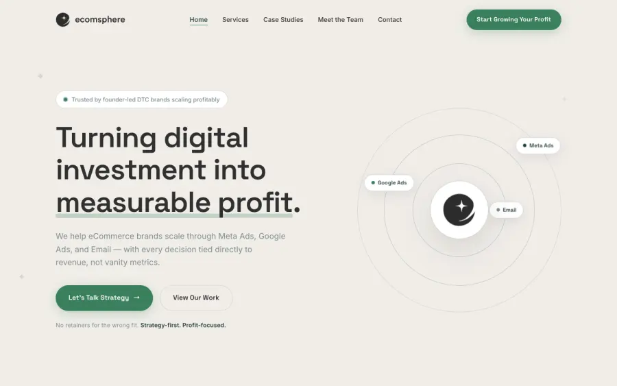
Ecomsphere preview, desktop: headline Turning digital investment into measurable profit, beside an orbit diagram.
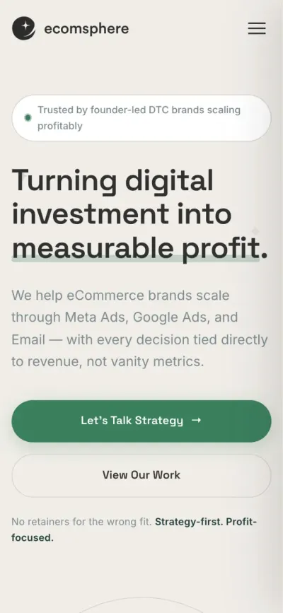
Ecomsphere preview on a phone: the same headline with two buttons.

In-house brand Preview

Ecomsphere

Performance marketing for e-commerce

Our founder's separate performance-marketing agency. The site turns one idea into the whole layout: every channel is a planet orbiting a single goal, profit.

Decisions

  • Services drawn as an orbit system, so Meta, Google and email read as one coordinated plan.
  • A strategy-first enquiry path built around a free audit rather than a hard sell.
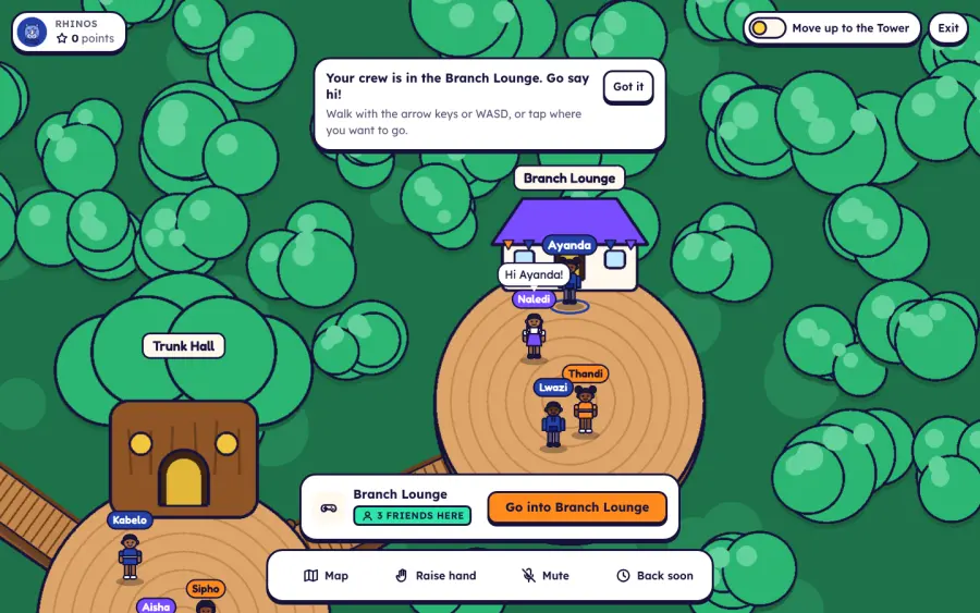
Squires House demo on desktop: a top-down illustrated treehouse world with paths, rooms and pupils.
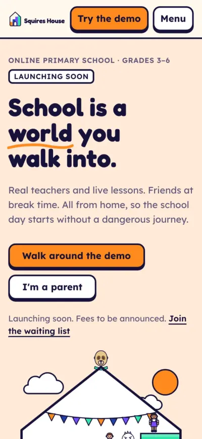
Squires House homepage on a phone: headline School is a world you walk into.

In development

Squires House

Virtual online schooling platform

A virtual online school for Grades 3 to 6, built as a world children walk into: make an avatar, explore the Treehouse, join a lesson, play at break.

Decisions

  • Kid-forward on top, with a calm parent layer for safety and cost.
  • A kind-words filter in chat that blocks unkind words, phone numbers, addresses and links.
  • Every colour pairing in the design tokens checked against WCAG contrast.
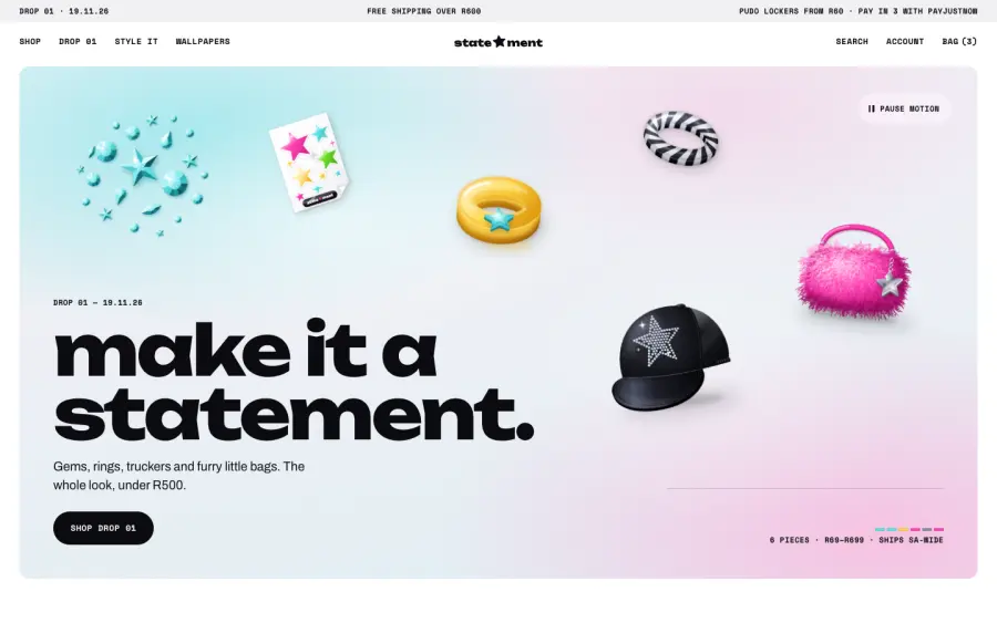
Statement homepage on desktop: make it a statement, with gems, a ring, a trucker cap and a furry bag floating on a soft gradient.
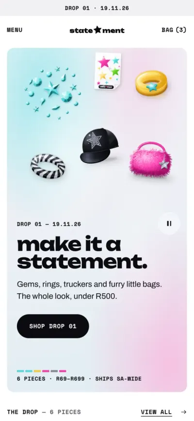
Statement homepage on a phone: the same products above the headline and a Shop Drop 01 button.

In development

Statement

Fashion & accessories e-commerce

A Shopify store for a fashion and accessories brand's first drop. The products are the statement: a quiet, spec-sheet storefront where colour only shows up where a product is.

Decisions

  • The page takes on the colourway of the product you're looking at.
  • One expressive type moment per page. Everything else stays small and quiet.
  • Built as a second theme beside v1, so the two can be compared one to one.

Shown with sample product renders.

Good websites don't start in Figma.

They start with good questions. Here's how we think about every project.

We listen first.

Your goals and your customers come before a single pixel. Then we get to work.

Beautiful to explore. Easy to use.

Interfaces your customers understand straight away, so they never have to stop and think.

Structure that makes sense.

Clear layouts and easy journeys, so people find what they came for.

We cut what doesn't earn its place.

No clutter, no filler. Every section has a job to do.

Point of view

We see what your customers see.

Every site starts from your customer's side of the screen. Where do they look first? What do they tap? Where do they get lost? We design for that.

Move the light · double-tap to blink

Services

Optimised for [conversion]

The right skills, applied for the right reasons. Every project is custom-scoped and quoted after discovery.

  1. Signature experiences

    For growing and established businesses that need deeper strategy, tailored UX/UI, e-commerce or lead-generation journeys, custom interaction, development and launch.

  2. Flagship & enterprise

    For larger, more complex builds: stakeholder discovery, architecture, design systems, defined accessibility and performance standards, complex functionality and documented acceptance.

  3. Focused custom projects

    Big plans. Sensible starting point. For smaller or early-stage businesses with a clear need: scoped discovery, UX direction, branded responsive design, development, technical SEO and analytics foundations, QA and handover.

What goes into a project

Platforms we build on

We pick the platform that suits the brief.

  • Custom HTML, CSS & JavaScript
  • Shopify
  • Next.js & React
  • GSAP & Three.js
After launch

Launch is a milestone, not the finish line.

InSight

Month-to-month

Keep it sharp. Keep it working.

Maintenance, website health and conversion-journey checks, technical SEO, minor updates, mobile and accessibility issue spotting, traffic and conversion snapshots where tracking exists, and support.

ForeSight

Three-month minimum

Built to improve. Month after month.

Strategy, maintenance, competitor insight, UX and conversion work, SEO and content, basic CRM and lead automation, and better tracking. One primary and one minor improvement shipped each month, within an agreed scope.

Offered after launch, never bundled by default. Scope and terms agreed in writing.

The process

Good work starts with good questions.

  1. 01Connecting…

    Discover

    We ask what needs to change, how your customers find and buy, who signs off and what success looks like.

  2. 02Connecting…

    Shape

    We map the journey, then design the look. You see it and sign it off before anything gets built.

  3. 03Connecting…

    Build

    We develop, animate and test across phones and desktops, then check it against what we agreed.

  4. 04Connecting…

    Launch & learn

    We go live together, hand over properly, and keep improving with InSight or ForeSight if you'd like us to.

Working together

You know your business. We know our craft.

One decision-maker, clear sign-offs

We agree who approves what, how many design rounds there are and when feedback is due. No guessing where things stand.

We'll tell you what we think

If a feature won't help your customers, we'll say so and suggest a simpler option.

  • goals
  • pages
  • functionality
  • platform
  • design rounds
  • acceptance
  • milestones
  • handover

A written scope, every time

All of it agreed before work starts.

Built to keep up

Modern, standards-based builds that are easy to look after and improve once you're live.

Made to be remembered

Distinctive design that looks like your brand. Tap the chrome.

custom-scopedquoted after discoverysupport after launch

Got a project
in mind?

Tell us what you're building. We'll work out the right approach. We aim to respond within 1–2 business days.

Prefer email? contact@websightstudios.co.za

Tell us what you need

What kind of project is it?
A rough range helps us suggest the right approach.

We collect your name, contact details and project information to reply to your enquiry and discuss your project. Form submissions are processed by our website host.